
Posted on: April 25, 2020
Written by: Mick Sherry
Many business owners have a confusing website that is costing them leads, sales and money on a daily basis.
In this post, I will explore one of the main problems preventing your business website from making more sales and/or generating more leads.
I will then show you a real life example of how a business website I found through Google search could improve their website to improve the user experience and even get more leads.
The Header: A Failure By Design
In my experience, many under performing business websites have a huge problem right from the beginning — The header.
The header section of the website is too complicated and confusing for a first time visitor or potential customer.
Hard Truth #1: Beautiful business websites don’t sell on their own. Easy to understand, user focused content is what sells products/services and if your website happens to be beautiful, all the better.
Above The Fold & The Four W’s
Your website header includes everything that you can see after landing on the homepage (without scrolling down.)
This is commonly referred to as the “Above The Fold” area.
Within the first 2–8 seconds of landing on your website, a potential customer must be able to answer 4 key questions.
The 4 Essential Questions (4W’s) You MUST Answer
- What is product or service that you’re business is offering or selling.
- What problem you does your service solve or how will your product benefit the customer.
- What action does the customer needs to take in order to buy your product or access your service.
- *Who you are.
*Notice I’ve put this last. Your business identity is the least important piece of information at the beginning of the customer journey.
This is powerful: Get it right and you are significantly closer to making a sale within the first 2–8 seconds of the customer landing on your website.
The Header: A Confusing Example
After searching in Google for about 5 minutes, I found quite a few contenders for this undesirable example. There is a plethora of bad business web page design on the Gold Coast of Queensland, Australia.
Note: This site is real, however the logos and/or identifying information have been changed or blurred.
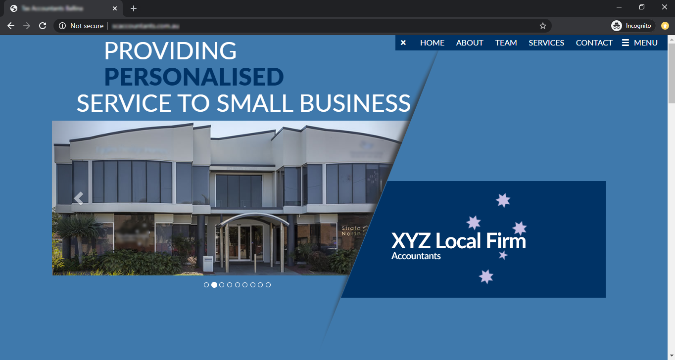
Why It Doesn’t Work
When looking at the example website, you will immediately notice it is very difficult to answer the 4W’s at first glance. Let’s go through them:
- Product offering/service: They don’t present you with an offer, but you would assume that they provide accounting services which are possibly targeted toward small business based on the logo and tagline.
- Benefit to the customer: This is unclear.
- How to buy: There is no call-to-action that lets you know how to do business with them.
- Business identity: After a little time, you’ll notice the logo which has been unconventionally placed in the bottom right corner and learn the identity of the business.
It‘s Costing You Sales
If the potential customer is unable to figure out the 4 pieces of basic information, they will do one of two things.
1) Take the easy way out: Leave the website (also known as a bounce) and visit the website of a competitor.
OR
2) Fumble around in the dark: Search your website for the answers they seek, become frustrated and probably end up leaving any way.
Don’t Overreact
There is no need to be ashamed or upset if your website is suffering from similar problems to this example.
Hard Truth #2: There is ineffective business web design everywhere.
If you look around the web at local businesses sites, you’ll notice the same mistakes are being made over and over again.
The beauty in something being broken, is it can be fixed.
The Header: An Improved Solution
If you’ve been wondering how you can make your business website better, check this out.
I’ve quickly re-imagined this website header to solve the issues (4W’s) I mentioned above.
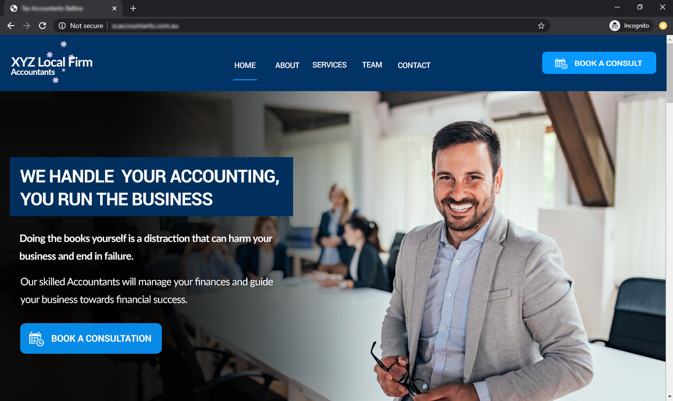
Obviously my design is rough and needs refinement, but you get the idea.
In this ideal example, it is much easier for a potential customer to discover the answers to all 4 of the essential questions without using any brain power. It’s dead simple and easy to understand.
Why It Works
There is nothing fancy here, the information is simply presented in a clear, logical and customer focused way.
This improved version of the header communicates all of the important information (4W’s) within 8 seconds.
The content and design elements are presented in a conventional way using many of the most common website design patterns.
The customer can clearly see what they need to do to make a purchase using the obvious call-to-action button.
You Can Fix These Problems Now – The Plan
Go back and look at the examples again.
Notice how I was able to drastically alter the look/feel/layout of the example website? Yet, I have ensured that the site stays true to the original styles, messages and branding of company.
An Actionable Plan Just For You
- Don’t Panic: In many cases, you don’t need to reinvent the website.
- Make Some Notes: Look at your existing website, note where the header does not answer the 4W’s.
- Prepare Content: Write new, customer focused content for your above the fold section. Choose more relevant imagery and decide on your primary call-to-action button.
- Get It Done: Contact your website designer to implement these changes. Make sure you listen to any extra guidance he/she may offer.
- Spread The Word: Launch your reinvented website header. I’d love to see what improvements you’ve made, so shoot me a message to let me know.
Key Takeaways
Avoid Confusion: When your website baffles potential customers, you’re losing sales every single day.
Keep It Simple: Make sure your web designer uses conventional user interface design and common web design patterns. Users are expecting a familiar experience when they land on your modern website, which means they expect your website to function just like every other website they use day-to-day.
Be Customer Focused: Rewrite your website content. Ensure that your sentences, paragraphs, images and videos are focused on:
- Identifying the problems / pain points of your customer.
- Empathising with your customer’s pain.
- Solving your customer’s problems.
- Showing your customer how great their life will be after they have done business with your company.
- Backing up your claims with credibility (qualifications, experience, testimonials, case studies.)
Need Help? Book A Consultation
Not currently working with a freelance web designer or digital marketing agency?
I can work with you to fix your business website so you can start getting more leads and making more sales.