
Posted on: May 17, 2016
Written by: Mick Sherry
In this simple CSS tutorial, we will be creating a centered horizontal navigation menu.
Centering a nav – fixed width vs fluid width
Using CSS can be tricky if you don’t first define a fixed width for the container of your list items…the thing is, no one wants to declare a fixed width element if it isn’t necessary.
In the world of responsive web design it is usually a good idea to avoid setting a fixed width on an element when possible.
Generally, elements with a fluid width will have greater flexibility when it comes to displaying across all device sizes and will be more user friendly if the webmaster is using a CMS.
Lets get started
To kick things off, here is our standard menu mark up:
<nav class="main-nav">
<ul>
<li><a href="#">Home</a></li>
<li><a href="#">About Us</a></li>
<li><a href="#">Projects</a></li>
<li><a href="#">Pricing</a></li>
<li><a href="#">Contact Us</a></li>
</ul>
</nav>
Now the basic CSS to get our horizontal navigation menu:
nav ul {
   list-style-type: none;
   margin: 0;
   padding: 0;
}

nav li {
   display:inline;
}

nav li a {
   padding:5px 10px;

}
As you can see below we have a very basic (and very vanilla looking) horizontal navigation menu.
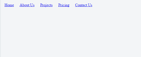
Since the list items are displayed as inline, they are now sitting horizontally and aligned to the left
Now we only need to add 2 extra CSS properties to make the menu items snap to the centre of the container (highlighted in bold).
nav ul {
   list-style-type: none;
   margin: 0;
   padding: 0;
   text-align: center;
}

nav li {
   display:inline;
}

nav li a {
   padding:5px 10px;
   display: inline-block;

}
The result:

As you can see, with two small tweaks to the CSS, it is easy to create a hassle free centered horizontal navigation without the need to set any fixed widths and is fully compatible with IE8 and above.
If you would like to see the above code in action please visit the JSFiddle here.
Why use this technique?
I like this technique is that I personally find symmetry and balance visually appealing in web design.
When working in my gold coast website design & development business, I will often resort to having the menu items spaced evenly and centered if it helps to create symmetry, compliments the overall layout and works for the client’s needs.